Having just obtained my new Nationaltrikots in good time for this summer’s festivities in Poland and the Ukraine – you can see them here – I thought I’d give you all a heads-up on one of the fake garments doing the rounds out there. OK, we all know where these come from – some sweatshop somewhere in India or Thailand, and then sold on to unsuspecting fans – usually those in search of a bargain on eBay.
I managed to get access to one of these fake shirts – thankfully, no money was paid for it – and as copies go this isn’t actually too bad an effort. The faults are pretty obvious to the experts and those with a rudimentary understanding of the German language, but many of these would probably fly well over the head of the average fan. Of course, this is just one fake design out of what I guess will be many: not all of them will look like this one, but at least you should know where to look. Obviously, some features are far more difficult to copy than others.
I managed to take a few photos of the counterfeit Trikot, and have compared it directly to the real thing so you can see the differences. It’s amazing to see the trouble some people will go to in trying to copy an elaborate design, while at the same time not bothering to invest in a German dictionary…
Overall View
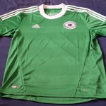
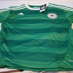
The most obvious feature about the fake Trikot is the colour – a bright racing/turquoise green as opposed to the core green or Lindengrün of the original. The makers of the copy have tried to emulate the look of the horizontal stripes by using a reverse weave method – not a bad effort, until you notice that on the genuine article this effect is caused by sections of the shirt being woven in a distinctive and very hard to copy “mesh” style.
Front Detail
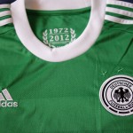
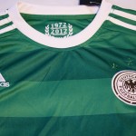
A closer look at the top of shirt provides a clear illustration of the difference in quality of the material and the construction; the horizontal meshed fabric panels of the genuine shirt can clearly be seen. Another giveaway is the poor construction around the neck: while the join between the white neck and the green material on the original garment is seamless, there is clear and obvious stitching running around the neck on the copy.
The Adidas logo is also strange-looking in the copy, as is the national crest, which is covered in more detail in the next pair of photographs.
National Eagle Crest
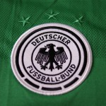
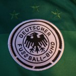
The difference in quality in the look, style and construction of the national eagle emblem is also a clear giveaway. There are a number of faults: the most obvious is the somewhat disjointed “Deutscher Fussball-Bund” legend, but there is also the rather strange-looking diamond-shaped head of the national eagle, curiously-shaped talons and the wings, which are completely filled instead of just being outlined in black.
The stitching of the badge is also of inferior quality, while the background material – not immediately apparent by looking at the illustrations – has been made using weaker material. The three green stars are also too far above the crest than they should be.
“1972-2012” Historical Legend
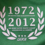
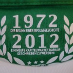
The design and layout of the “1972-2012” legend inside the shirt provides a clear difference between the genuine article and the copy. Not only is the typeface completely different, but the person who has created the design for the copy clearly has no knowledge of the German language.
One can only guess that the person who created the iron-on transfer for the copy had seen a scratchy rendition of the original – individual letters have clearly been misidentified, though many of these errors could have been solved by having an elementary understanding of German or even access to a German dictionary. While the first line der Beginn einer Erfolgsgeschichte has been correctly applied, the second, ein neues Kapitel wartet darauf, geschrieben zu werden! has been morphed into the ein meufs Kapitel geschrieben zu werdeni – which is of course complete nonsense.
The security “parallelohologram”
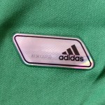
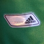
In fairness, the counterfeiters have made a pretty good fist of the parallelogram-shaped security hologram, right down to the individual manufacturer’s code. If there is any obvious fault that can be seen, it is the way the item has been applied to the shirt and the lack of clean edging. Though we are really going into the finer detail here.
The “Climacool” logo


OK, we are really looking for every small fault now, but on the original shirt the “Climacool” logo on the right side of the shirt (lower left if you are the wearer) is a distinct two-colour design, with “Clima” in white and “Cool” in a metallic silver. On the copy, it is just one word in white.
Deutscher Fussball-Bund legend in cursive script
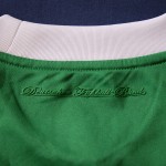
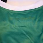
The final detail is the very subtle “Deutscher Fussball-Bund” legend in cursive script, which is positioned on the reverse of the shirt just below the neckline. On the original this feature is a highly distinctive embossed design, while the copy has a clearly inferior iron-on transfer that looks completely out of place.
So, there we have it – I have picked out the obvious faults, but I am sure your local Adidas football shirt inspector could highlight a good many more. To make gratuitous use of that well-worn maxim: if it looks too good to be true, it probably is!

The national eagle on the fake one looks like what I believe has been the symbol of the German Auto Club for a number of years.
in Peru the prize in 65 us dollars, very expensive her…in Peru es kostet ge us dollars, sehr teuer! -grun trikot und weiss trikot-