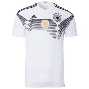
With the World Cup finals just around the corner, it was always going to be time to unveil a new Nationaltrikot. But with today’s big reveal, it means that the Mannschaft has changed its white home shirt for the third time in three seasons. The (now) previous design, worn during the recent Confederations Cup success, is out after less than a year.
Zurück in die Zukunft
Yet another rapid kit change will inevitably rekindle the discussion about unnecessary marketing missions, and more money being spent by fans. But for Nationaltrikot enthusiasts, the new design will surely provoke a number of differing opinions.
If the Confederations Cup design took its cue from the green away shirt sported at Italia 1990 with its “watermarked” pattern, the Russia 2018 edition pays homage to what is arguably the greatest Nationaltrikot of all time. The white “flag” shirt that was worn for four years between 1988 and 1992.

The new shirt really is an illustration of taking things back to the future. Indeed, the DFB use this same turn of phrase themselves. Zurück in die Zukunft. The only thing missing during the official fashion show launch was a guest appearance from Marty McFly.
Marvellous monochrome
The layout is rather like a slightly faulty monochrome photocopy of the 1990 design, with the three “shades” created by black horizontal lines of decreasing thickness. The design is undoubtedly modern, but with a clear reference to the traditional Schwarz und Weiss look. No, there is no need to adjust the colour settings on your mobile handset, tablet or desktop monitor.
It is the first time since 1986 that the white home shirt has no colour in it. Some will remember the old school Trikot worn during the World Cup in 2002, but even that had a small device in the German national colours at the back. This new Trikot is like seeing the 1990 kit on a television set used to watch the Wunder von Bern in 1954.
More eagle-eyed observers (see what I did there?) will notice another difference. The layout of the design is the horizontally flipped reverse of the original, with the “dip” appearing on right immediately below the national eagle rather than on the left under the Adidas logo. Either way, there is a perfect balance. Like the 1990 design, this new version shares the same classic white scalloped collar.
OK. There is a little Schwarz-Rot-Gold device. Neatly tucked away on the inside of the neck. So neatly tucked away that you will need to know that it is there.
Retro font
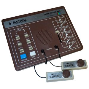
The “back to the future” appearance of the new Trikot is accentuated by the introdution of a new font for the player names and numbers. At first glance the numbers look like they belong on a primitive electronic scoreboard one might have found in the former Eastern Bloc. A second glance sparks memories of the television video games that were popular in the 1970s. Some of you will remember Binatone, later sponsors of Brighton and Hove Albion.

Like the Trikot itself, the name and number font is something that will surely divide opinion. While some will immediately like the retro video game look, others will probably find it ugly. Then there will be those who will start calling Mesut Özil “Ö2IL”. GR8, LOL.
I am not massively keen on the font style in itself, but it works really well with this design. Which also works for me. I really like the nod to 1990, as well as the monochrome style. If anything, the FIFA World Champions patch ruins things a little – a strange blob of pale gold dropped almost arbitrarily in the middle of what is otherwise a clean design.
Ultimately, it does not really matter what the team is playing in next year, so long as they do well at the tournament. But after just one decent sighting, this already looks like a World Cup winning Trikot.
